Custom Components are highly flexible components that allow specific actions in a journey. They are created and configured once to be reused multiple times in one or more journeys. Currently, the following types are supported:
Web — A web service is called to which input parameters can be passed and an output is generated. For example, after filling out a form, some of the form data is passed on as parameters to the Custom Component, then the web service is called using these parameters, and an output is generated. That output can then be used further on in a journey.
Stored Procedures — This type executes a specific Stored Procedure such one that updates or deletes records, creates new records, and so on. (The Stored Procedures are created in the Admin configuration with type journey.)
Custom channel — This type of Custom Component makes it possible to execute anything in a journey that is not possible using the standard journey components. Think about direct print, helpdesk follow-up, Onsite Intervention. The option is available only for users with permission rights for Custom Components. (Custom channel Endpoints are configured in Admin Configuration, on the Global tab)
Connector message sync — This type of Custom Component makes it possible to create / update / delete CRM information from within a Custom journey execution through a CRM Connector instance. The option is available only for users with permission rights for Custom Components, and for CRM Connectors for which the option 'Custom component - message sync' is enabled. (Connectors are configured in Admin Configuration, on the Data Integration tab.)
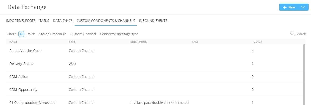
When accessing the Custom Components section, a Start page is available giving an overview of all existing Custom Components. The Start page presents information on the Custom Component usage and allows the user to edit, duplicate, or delete a Custom Component.
Custom components are stored in folders and follow the same folder structure and management as for the other chapters. (More details on folder management can be found here
1. To create a new Custom Component, go to the Data Exchange fly-out menu and select Create Custom Component or, on the Custom Component Start page, click Create New.
You can choose between Web, Stored Procedure, Custom Channel or Connector Message Sync.
A properties panel is displayed:
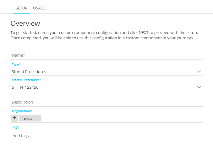
Name — Set a name for the component and make sure to give an explicit name as this will be used in the journey builder to select the Custom Component.
Type — Select the type of component. One of the following choices can be made :
- Web — A HTTP request is made to which input parameters can be passed on. The request can return output parameters that can then be used in the journey. The input and output parameters are defined on the corresponding steps.
- Stored Procedures — When this type is selected an additional field is available and a Stored Procedure of type 'journey' can be selected. (These Stored Procedures are created in the Admin Configuration tool).
- Custom Channel — When custom is selected, an additional field is available to select a custom channel endpoint from a drop-down list. (Custom channel Endpoints are configured in Admin Configuration, on the Global tab)
- Connector message sync — When this type is selected, an additional field is available to select a CRM connector from a drop-down list. (All CRM connectors are listed that have 'message sync' enabled in the Admin Configuration and that are available for the current organization.)
Icon — You can select a different icon to use for the component by clicking the icon and selecting a different one from the list of available icons: 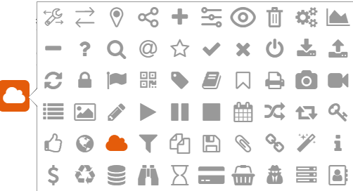
The selected icon will be used in the custom journey when the component is placed on the canvas, and also in the component properties panel.
Description — Provide a clear description of what this component does.
Execution retry — A maximum number of 3 retries can be set. If the execution fails, a new attempt will be made until the selected number of retries is reached. This option is not available for stored procedure custom components.
Organizations — Select one or more organizations for which this Custom Component must be available.
Asset label — The label(s) assigned to this asset. Select one or more labels from the drop-down. (These labels are configured in the Admin configuration.) Users with the proper Access permissions can also create new labels here by typing the new label value in the field.
2. When done, press Next.
Note Specific rights are required to be able to create a Custom Component.
The next step shows the input parameters with their default values (according to the type of Custom Component — see the different types below).
Note: The following types of Input parameters can be set: Text, LongText, Boolean, Date, Datetime, Numeric, Float, Long and Option List.
Important Note: Option List is only available for Custom Components of type Custom Channel.
When Option List is selected as type of input parameter, you can select the Option List from the drop-down in the Length/List field. An optional default value can be set in the Value column.
You have the possibility to check/uncheck the 'Visible' checkbox for each input parameter, to define if the parameter should be visible or invisible at Journey level (in the CRM Component properties). This can be applied for all types of Custom Components.
When you set a parameter as 'invisible' (uncheck the checkbox) while it's a required parameter (shown with a *) and no default value is set (in the last column), an error icon appears :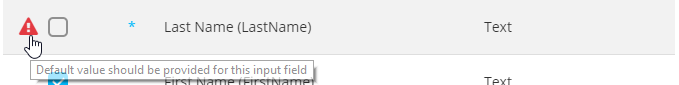
'Invisible' parameters use the default value set, once the Custom Component is used in a Journey.
They are not visible in the Custom Component properties, while fields that are defined as visible are available in the Journey.
In this topic:
- Create a Web Custom Component
- Create a Stored Procedure Custom Component
- Create a Custom Channel Custom Component
- Create a Connector message sync Custom Component
- Usage
- History
Create a Web Custom Component
The next step is to define the properties. On the setup page you need to enter the following:
Input tab
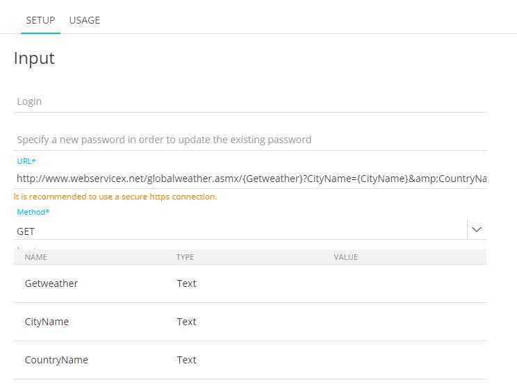
1. Login and password — You can add a basic authentication for the web service. These credentials are used when calling the webservice. These fields are not mandatory and need only be filled out if the web service requires authentication.
2. URL — This is the URL of the HTTP request. It is recommended to use secure HTTPS connections. The URL must also contain the input parameters. They are added using the following syntax: PARAM1={xxx}. When the URL is set with input parameters, these are automatically extracted and displayed in a grid.
Example:
http://www.webservicex.net/globalweather.asmx/{Getweather}?CityName={CityName}&CountryName={CountryName}
3. Method — Select the request type to be used for the request.
- GET — View the resource and add the input parameters to the URL.
This is the result.
- POST — Create a new resource. A + button is available to manually add input parameters. Each parameter shows a bin icon to delete it. The parameters are not added to the URL.

Note: When you switch from the Get method to the Post method, the input parameters that are present in the URL are removed from the URL, but are still available in the list and become editable.
When you switch from the Post method to the Get method, the input parameters are added to the URL and are no longer editable in the list.
Note: The Editable column indicates that the parameter is exposed and visible in the journey in which the Custom Component is being used.
- PUT — Update an existing resource.
- DELETE — Delete a resource.
- PATCH — Modify an existing resource. The Request body only needs to contain the specific changes to the resource, unlike the PUT method where the complete new version of the resource needs to be added.
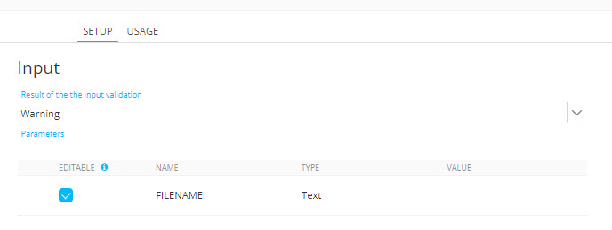
4. Result of the Input validation — Choose between
- Warning — A warning is returned when invalid parameters are detected in the journey. The journey continues with the given parameter values
- Error — An error is thrown when invalid parameters are detected in the journey and the journey is not executed
5. Input Parameters — An input parameter is a variable that can be sent with the HTTP request. Parameters that are added can be referenced inside the URI of a Custom Component API endpoint to facilitate the option of a dynamic API endpoint URI or to make the request dynamic. Enter the input parameters for the given URL. Following properties can be set:
- Editable — When ticked, the parameter is visible and editable in the journey.
- Name — Displayed in the journey to identify the parameter
- Type — The expected type of value for this parameter. A choice can be made between text, longtext, boolean, numeric, float, long, date, datetime
- Value — The default value selected when using the Custom component in a journey
Note: Input Parameters can't be combined with Body Parameters. Switch Body Type to 'No Body' if you want to use Input Parameters.
6. Headers — A header allows technical marketers to define API request headers. With headers additional information can be passed with an HTTP request or response. It is used for additional settings and configuration such as authentication, caching options, accepted types of content and more.
Note:
An authorization element is automatically added to the Header section when the Custom Component requires a login and password.
The following properties can be set:
- Editable — When ticked, the header is visible and editable in the journey.
- Name — Select the name from the drop-down list. All supported header types are listed. This name is case insensitive.

- Value — The default value selected when using the Custom component in a journey. This value is case insensitive and white spaces before the value are ignored.
- Sensitive — Sets the content of the header field as encrypted when displayed in the journey.

Some Header examples :
- Content-Type : application/x-www-form-urlencoded, application/json, etc.
- Authorization : Basic XXxxXxxXXXx==, Bearer XXxxXxxXXXx==, etc.
- Origin : http://www.example-who-makes-the-request.com
- API-Key: xxxxxxxxx
More examples can be found here:
https://en.wikipedia.org/wiki/List_of_HTTP_header_fields
7. Body Type — Can either be No Body or JSON.
Notes :
1 - The 'Body Type', 'Body Structure' and 'Body Parameters' sections can only be used when the selected method above is POST, PUT, DELETE or PATCH.
When GET is selected, no Body sections are shown.
2 - When JSON is selected as body type, input parameters can't be entered.
The following sentence is shown in the 'Input Parameters' section: "Input Parameters can't be combined with Body Parameters. Switch Body Type to 'No Body' if you want to use Input Parameters."

- No Body — No 'Body Structure' area and 'Body Parameters' grid are shown underneath.
- JSON — When selected, a 'Body Structure' area and a 'Body Parameters' grid are shown underneath.
Also, in the Headers grid above, 'Content-Type: application/json' is automatically added as a read-only field.
As with input parameters, this JSON is added within the body of the request.
8. Body Structure — This area is only shown when above JSON is selected as Body Type.
By default, JSON code editor is empty. Here, a JSON structure with values can be entered to automatically populate the Body Parameters grid below.
-
You can paste any JSON from your clipboard inside the Body Structure area.
-
Validations are in place for the JSON structure.
- Validation example 1 :

- Validation example 2 :

-
As soon as JSON content has been pasted into the Body Structure area, values are automatically replaced by placeholders (eg. {{Firstname}}) :

The reasoning behind this is that the Body Structure section is designed to define the JSON 'structure'.
'Values' need to be changed in the Body Parameters grid underneath. -
You can also update the JSON structure manually in this field.
Warning: Keep in mind that when manually editing content in the Body Structure field, updating parameter values won't have any effect on existing parameters in the Body Parameters grid !
The values linked to the existing JSON parameters will still be shown in the Body Parameters grid (the system keeps these in memory).
As the purpose of the Body Structure is to define the JSON structure, it only makes sense to add / remove parameters in here, or update parameter names.
9. Body Parameters — This area is only shown when JSON is selected as Body Type above.
As long as the Body Structure area is empty, the Body Parameters grid is also empty.
As soon as JSON has been added inside the Body Structure area, the Body Parameters grid gets automatically populated with the applicable parameters with their names, types and default values.
The following can be configured for each parameter :
- Editable — When ticked, the body parameter is visible and editable in the journey in which this Web Custom Component will be used. By default, each parameter is ticked as editable.
- Name — Each body parameter name is a read-only field that gets auto-populated with the name set in the Body Structure.
- Type — This can either be Boolean, Numeric or Text.
- Value — The default value selected when using the Web Custom Component in a journey.
- This value is case-insensitive and white spaces before the value are ignored.
- Validations are in place.
For example : When the type is numeric, the value can't consist of textual characters.

- Numeric parameters can be integers or decimals.
- Nullable — This checkbox can be checked/unchecked for 'Text' parameters. For Boolean and Numeric parameters, it's grayed out and nullable by default.
- When checked, empty parameter values will be registered as a NULL value.
- When not checked, empty parameter values will be registered as empty strings.
- Sensitive — The content of the body parameter is encrypted, and will be displayed as such when used in a journey.
The JSON parameters are shown in the Body Parameters grid with a particular format.
Example 1 — a nested object :
{ "password": { "value": "{{password.value}}" } }
=> This will give “password.value” as the field name in the grid.
Example 2 — an array of objects :
{ "Pet": [ { "Name": "Richard", "Species": "Dog" }, { "Name": "Smoothie", "Species": "Cat" } ] }
=> This will give “Pet.0.Name, Pet.0.Species, Pet.1.Name, Pet.1.Species” as the field names in the grid.
Note: The number of array items is fixed (depending on your JSON structure defined).
If you do not know the exact number of array items needed at the point of setting up the Custom Component, you could foresee extra items in the array, and enable the "nullable" option. That way, when no value is provided, they will return 'null' instead of an empty string.
After completing the setup and saving the Custom Component configuration, Body Parameters are then visible inside the properties when using this Custom Component in a Custom Journey. See this section for more info.
When to use Input Parameters versus Body Parameters
It depends on what the endpoint needs :
If the endpoint expects QueryString parameters (No content-type related)
- Method: Get
- Input Parameters: Yes
- Body Type: No Body
If the endpoint expects Post Parameters (Content-Type: application/x-www-form-urlencoded)
- Method: Post, Put, Patch, Delete
- Input Parameters: Yes
- Body Type: No Body
If the endpoint expects Json (Content-Type: application/json)
- Method: Post, Put, Patch, Delete
- Input Parameters: No
- Body Type: Json
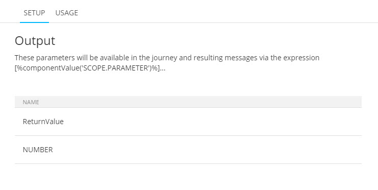
Output tab
In the next step, you need to define the output parameters generated by this request. These output parameters will be available in the journey and can be requested by using the following expression: [%componentValue('SCOPE.PARAMETER')%]
To add a new output parameter, click the + icon and enter the name of the parameter.
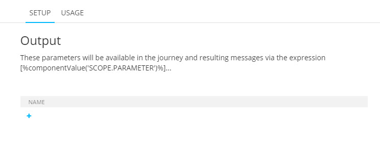
Add as many parameters as required and returned by the HTTP request.
Note:
If the webservice call has a JSON response type, the response can be used as an output parameter in the Custom Component setup.
By using [%componentValue('SCOPE.RESPONSE')%], the entire JSON content can be passed to a Stored Procedure or elements shown on a page within a jsonValue() function, instead of the regular [%componentValue('SCOPE.PARAMETER')%] usage.
Example to get a JSON response and show it on an Engage page :
- We'd like to get the JSON response from the Joke API (https://sv443.net/jokeapi/v2/), which is in the following format :
{
"setup": "joke question",
"delivery": "joke punchline"
}
- In the Engage Custom Web Component, the URL is set on the Input tab to do the API call (for example : https://v2.jokeapi.dev/joke/Any?type=twopart)
- On the Output tab, we add the RESPONSE parameter (this needs to be 'response', no other naming will work for JSON data).
- On the Validation tab, when clicking 'Run test', we can see that the entire JSON value is shown.
- In the Content chapter of Engage, we create a page with a text component that calls the joke question and punchline from the API call set in the Custom Component.
* For the question : [% jsonValue(componentValue('KM_CC_Joke3.RESPONSE') , 'setup') %]
* For the punchline : [% jsonValue(componentValue('KM_CC_Joke3.RESPONSE') , 'delivery') %]
- In the Journeys chapter of Engage, we create a Custom Journey that triggers the Custom Component, and shows the page on success.
- The page will then show the JSON data we needed, namely the joke question ("setup") and the joke punchline ("delivery").
Note :
For all other uses, the response type in the webservice call should return 'Content-Type: text/plain' and each output parameter can be extracted one per line, in a flat structure using the '[PARAMETERNAME]:[PARAMETERVALUE]' notation.
For example, don't use Content-Type: text/plain; charset=utf-8 as it's not supported, and only use flat parameters.
Example to get a plain text response :
- Add the parameter names on the Output tab of the Web Custom Component setup.
- You can then for example fetch the values in an Engage page, like this :
* joke question (setup) = [% componentValue('KM_CC_Joke2.SETUP') %]
* joke punchline (delivery) = [% componentValue('KM_CC_Joke2.DELIVERY') %]
Summary:
- if the response is plain-text, [% componentValue('SCOPE.PARAMETER') %] can be used to get values.
- if the response is JSON, [% jsonValue(componentValue('SCOPE.RESPONSE'), 'PROPERTY_NAME') %] can be used to get values.
Example of a php webservice call:
<?php
header('Content-Type: text/plain');
$request = $_GET['MAIL'];
echo "MYOUTPUT: _$request_";
?>
where MYOUTPUT is the PARAMETERNAME, and the part after the colon sign (_$request_) is the PARAMETERVALUE
It will return a single value, eg. "_sample@example.com_"
When done, press Next to go to the Events step.
Events tab
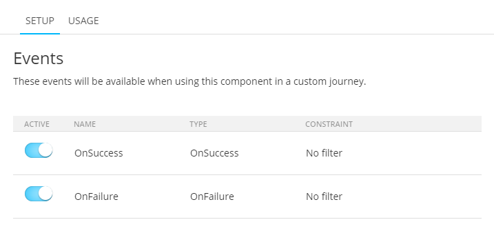
Events will be available when using the web Custom Component in a Custom Journey.
The following fields are visible :
- Active — Switch, which is enabled for both events.
- Name — 'OnSuccess' / 'OnFailure'.
- Type — 'OnSuccess' / 'OnFailure'.
- Constraint — 'No filter'.
Note: The events page is read-only.
Press Next to go to the Validation step.
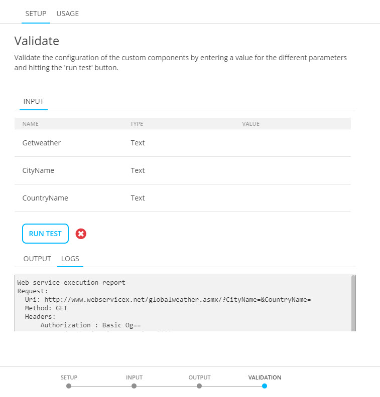
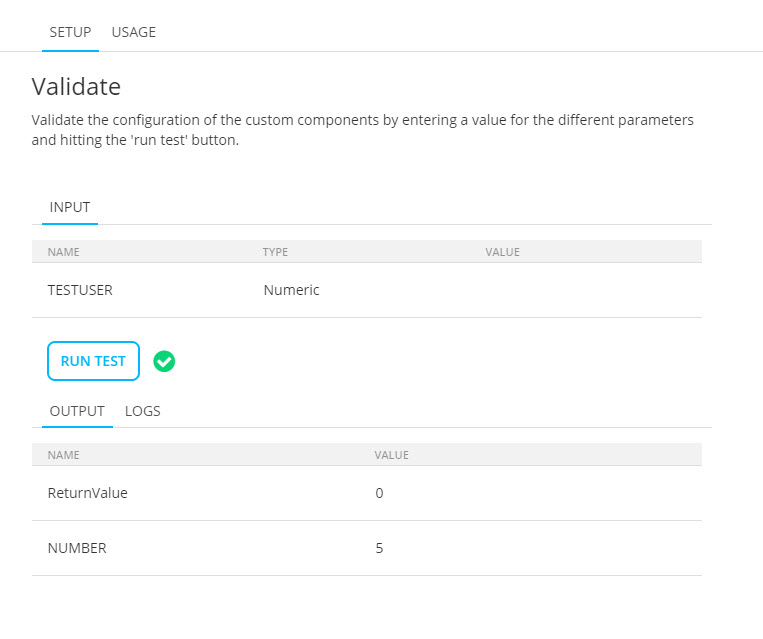
Validation tab
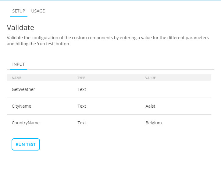
You can test the execution of the web service call. To do this, enter some valid input values and click Run test.
If the execution is successful, the output is displayed. The logs provide details on the input sent and the output returned.
When done, press Create Custom Component. The Custom Component is now available for use.
Example:
Create a HTTP request that returns the weather for a specific city in a specific country.
The following URL us used: http://www.webservicex.net/globalweather.asmx
When this HTTP request is called, two input parameters can be sent along: CityName and CountryName.
The complete URL to type in for this Custom Component looks like:
http://www.webservicex.net/globalweather.asmx/{Getweather}?CityName={CityName}&CountryName={CountryName}
— {Getweather} is the method to be called and CityName and CountryName are the input parameters.
When this method is called after a form, the parameters are filled out by using the following expressions to retrieve the values from the form.
[%input('CityName') and [%input('CountryName')%]
Create a Stored Procedure Custom Component
After selecting the correct Stored Procedure and setting the properties, the next step displays all input parameters detected in the Stored Procedure. Default values can be set here.
Click Next. The following step returns a list of output parameters which can be used in the journey using the following expression: [%componentValue('Variable')%].
Click Next to go to the Events step.
Events will be available when using the Stored Procedure Custom Component in a custom journey.
The following fields are visible :
- Active — Switch, which is enabled for both events.
- Name — 'OnSuccess' / 'OnFailure'.
- Type — 'OnSuccess' / 'OnFailure'.
- Constraint — 'No filter'.
Note: The events page is read-only.
Press Next to go to the Validation step.
On the Validation step, you can test the Stored Procedure.
Enter values for the input fields and click Run test.
The output of the test is displayed and logs are available.
Click Create Custom Component. Your Custom Component is now available for use.
Example : Setup and use a Custom Component of type Stored Procedure
Create a Custom Channel Custom Component
After selecting the right custom channel, preferred icon and other settings, click Next to display the input parameters for the channel, if available.
The input parameters depend on the selected custom channel.
Default values can be set for the different parameters by clicking in the 'value' column and entering a value manually for the parameter.
When an input parameter is linked to an option list, the field value can be selected from a drop-down list.

When the plugin configuration allows it, custom parameters can be added as input parameters.
Note: Parameters that are created as output parameters, and are set as 'also input', are automatically visible as input parameters here.
See output parameters below.

- Add a new custom input parameter — This can be done by clicking on the + sign. By default, a new custom parameter is set to 'visible', not required, and not used as output parameter. The default name starts with 'NEW_FIELD_' and an index for each new parameter (eg. 'NEW_FIELD_1'). Its type is text, with a length of 50. All of these values can be modified to your needs.
- Delete a custom input parameter — This can be done by clicking on the bin icon on the right.
- Also Output checkbox — Enabling this for a custom parameter by checking the box, will show and use the input parameter as output parameter too (visible in the Output step).
- Required checkbox — Enabling this for a custom parameter by checking the box, will set the custom parameter as a required parameter.
- Editable — indicates that the parameter is exposed and visible in the journey in which the Custom Component is being used.
When done, click Next. The following step returns a list of output parameters. Note however, that at this point, due to technical reasons these output parameters cannot be used in a journey.

When the plugin configuration allows it, custom parameters can be added as output parameters.
Note: Parameters that are created as input parameters, and are set as 'also output', are automatically visible as output parameters here.
See input parameters above.
- Add a new custom output parameter — This can be done by clicking on the + sign. By default, a new custom parameter is not used as input parameter. The default name starts with 'NEW_FIELD_' and an index for each new parameter (eg. 'NEW_FIELD_1').
- Delete a custom output parameter — This can be done by clicking on the bin icon on the right.
- Also Input checkbox — Enabling this for a custom parameter by checking the box, will show and use the output parameter as input parameter too (visible in the Input step).
On the Events tab, all events detected for the custom channel are listed. Next, custom events can be defined for the selected custom channel endpoint.
These events can be used in a Recurring Batch Custom Journey after a Custom Component.
For each custom event, define a name, event type and constraint(optional). Click the + icon to create a new custom event.
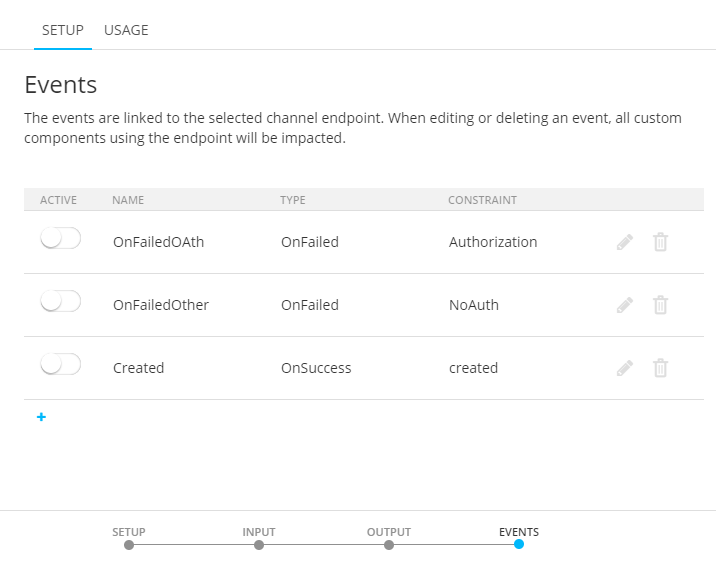
Possible types of event that can trigger the custom event are:
- OnFailed — The execution of the Custom Component failed.
- OnSuccess — The execution of the Custom Component was successful.
- OnFeedback — The execution of the Custom Component gave feedback.
The constraint will limit the custom event to the defined conditions only.
Events can be activated for a specific Custom Component. This defines if the event will be available in the Journey when this Custom Component is used.
Note: Each custom event will also be available for all other Custom Components using this custom channel. Use the Active toggle to activate/deactivate events for a specific Custom Component.
Create a Connector message sync Custom Component
When you choose Connector message sync as Custom Component type, you can select any available CRM connector in the organization.
Depending on the chosen CRM connector, the icon is automatically updated (and can still be changed manually).
| MS Dynamics icon : | Sugar CRM icon : | SalesForce icon : |
|---|---|---|

|

|

|
After selecting the Connector message sync type, the specific CRM connector and setting the properties, the next step displays a drop-down containing all CRM messages associated with the selected CRM connector. When you choose a message, all input parameters are shown that are available for that CRM message. Values can be set here. Mandatory parameters are marked with an asterisk.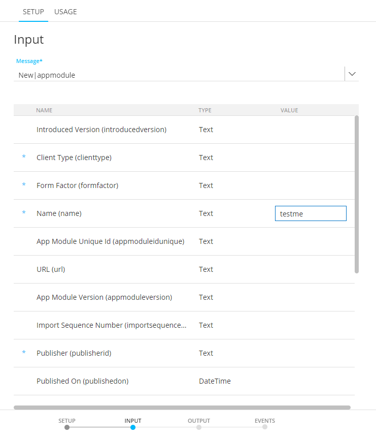
Click Next. The following step contains text explaining that message syncs do not have any output parameters (though other Custom Component types do).
Click Next. The Events step is the final step.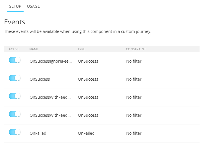
Events are listed that are linked to the CRM message that was selected. They will be available when using the Connector message sync custom component in a Custom Journey.
The following fields are visible :
- Active — Switch, which is enabled for all events.
- Name — Event name.
- Type — Event type : OnSuccess, OnFailed or OnFeedback.
- Constraint — The constraint that is set, or 'No filter' in case no constraint is set.
The events page is read-only.
Click 'Create Custom Component'. ('Update Custom Component' when you're editing an existing Connector message sync custom component.)
The created Connector message sync is visible on the Custom Component Start page.
When you edit an existing Connector message sync, the 'input' step is opened by default. The 'message' drop-down is read-only.
On the 'setup' step, the 'CRM connector' field is read-only. The 'type' can still be changed (for example to type 'web'). When doing so, the next steps change accordingly, to support configuration for the selected type of Custom Component.
Usage
The Usage tab shows the journeys where the Custom Component is used. Components that are currently used in a journey cannot be deleted.
From the overview you can jump straight to the journey.
Note: When the Custom Component is used in a Journey that resides in a folder the user has no access to, the journey will not be listed in the Usage dialog.
History
The history gives insight on where the Custom Component is used and the execution details.
After selecting the journey from a drop-down list of linked journeys, all Custom Component execution details for that specific journey are listed.
- Custom channel name (as created in the Admin configuration)
- The fields of the custom channel. Depending on the selected custom channel, this list of fields will differ and hold the fields retrieved from the corresponding channel as well as the custom fields.
- The method used (ADD or UPDATE)
- Creation date
- State
- Execution date and time
- in case of fail, the error returned
The following states can be returned:
- 1= pickup
- 2= in progress
- 10= error
- 20= batch: file was created but not yet send
- 25= wait feedback
- 30= success (executed)
- 35= feedback error: successfully processed but a feedback error has occurred
- 40= feedback
- 50= canceled
- 60= no handler: no handler was found (incomplete dispatch logic)
- 61= blocked by rule
